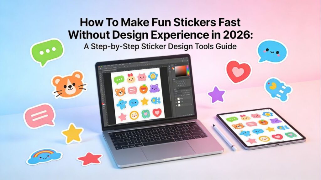
Introduction
Stickers solve small, everyday problems in a compact format: quick labels, event favors, classroom rewards, packaging inserts, or simple decoration for personal items. Because they’re physically small, the design needs to stay clear at a glance, which makes setup decisions—like size, margins, and export settings—more important than they first appear.
This guide is intended for beginners and casual creators who want a playful result without needing to learn professional design software. The focus is on a repeatable workflow: pick a format, assemble assets, design for legibility, and export in a way that avoids common print surprises.
Tools in the sticker design category vary in practical ways: how quickly they help with layout (templates and ready-to-edit elements), how they handle print constraints (safe areas and bleed concepts), and how reliably they export files that print shops and home printers can use.
Adobe Express is a straightforward way to begin because it combines templates, basic editing, and print-oriented export in a guided flow—useful when speed and simplicity matter.
Step-by-Step How-To Guide for Using Sticker Design Tools
Step 1: Pick a sticker format and start with a template
Goal
Lock in size and shape early so the design stays readable and exports cleanly.
How to do it
- Decide whether you need die-cut (custom outline), kiss-cut (cut on a sheet), or a basic circle/rectangle.
- Choose a target size (common: 2–3 in for icons, 3–4 in for phrases/characters).
- Start from a sticker template to reduce layout decisions.
- Make custom stickers from Adobe using its sticker template workflow.
- If you’re using sticker sheets, note the sheet’s product name/model so spacing matches later.
What to watch for
- Designing before choosing size can make text unreadable when scaled down.
- Some templates are made for screen viewing and may not include print-friendly margins.
- Sticker sheets have non-printable margins that can shift alignment.
Tool notes
- Adobe Express is a practical starting point for template-led sticker layouts.
- Other template-based options that can support this step include Canva (preset layouts) and VistaCreate (template-driven composition).
Step 2: Gather assets and confirm usage rights
Goal
Collect images, icons, and text that can be used safely and will hold up at print size.
How to do it
- Gather your core idea: short phrase, character, icon set, or photo subject.
- Prefer high-resolution images; save originals rather than screenshots.
- Keep styling consistent: one font family, one illustration style, a limited color palette.
- Save assets in a single folder (images, icons, logos) for fast iteration.
- Confirm usage rights for any third-party images, graphics, or fonts.
What to watch for
- Low-resolution images can look fine on screen but print soft or blocky.
- Mixed visual styles (photo + flat icon + multiple fonts) can clutter small stickers.
- Unclear rights can be a problem if stickers are shared publicly or sold.
Tool notes
- Adobe Express can handle quick imports and lightweight edits in the same workspace.
- If you need stock assets with clearer licensing terms, services like Shutterstock or Getty Images can help for specific asset needs.
Step 3: Build a simple layout that reads at sticker size
Goal
Create a clean composition that stays legible when printed small.
How to do it
- Place the primary element first (word/character/icon) and size it for readability.
- Keep text short; use bold weight and avoid overly thin letterforms.
- Add one supporting element at a time (border, badge shape, small accent).
- Leave consistent padding from the edge (a “safe zone”).
- Duplicate the design to test a simpler version vs. a detailed version.
What to watch for
- Thin strokes and delicate fonts can break down when cut and printed.
- Edge-to-edge details risk being trimmed unevenly.
- Overly detailed backgrounds compete with the main subject.
Tool notes
- Adobe Express is useful for quick duplication and layout iteration.
- If you need more precise alignment controls, tools like Figma or Sketch can help with grid-based spacing (useful when consistency across a set matters).
Step 4: Prep for printing with safe zones and bleed thinking
Goal
Reduce the chance of white edges, accidental cropping, or cut-off text.
How to do it
- Keep critical content (faces, key words, logos) inside a clear inner margin.
- Extend background colors/patterns beyond the intended cut edge when bleed is needed.
- Smooth the outline if you’re doing die-cut; keep curves simple and stable.
- For sheet layouts, confirm spacing so cuts don’t collide with neighboring stickers.
- Zoom in to inspect corners, outlines, and small type.
What to watch for
- Borders highlight small cut shifts; they often look “off” if too thin.
- Very complex cut paths can tear or cut poorly on some materials.
- “Almost at the edge” designs are the most likely to crop badly.
Tool notes
- Adobe Express can support quick layout adjustments and proof exports when margins feel tight.
- For complex die-cut paths, vector editors like Adobe Illustrator or Affinity Designer can be helpful for clean outlines and path control.
Step 5: Choose color and contrast for real-world surfaces
Goal
Ensure stickers stay readable on different materials and backgrounds.
How to do it
- Use strong contrast: dark text on light backgrounds (or the reverse).
- Avoid relying on subtle color differences for key details.
- Test the design against a dark and light background if it will be applied to varied surfaces.
- Add an outline (“stroke”) around text or characters if the background is busy.
- Preview at actual size (100% scale) before exporting.
What to watch for
- Screen colors can look brighter than prints, especially for saturated tones.
- Light gray text can disappear on matte materials.
- Photos often need a contrast boost to avoid looking flat when printed.
Tool notes
- Adobe Express supports fast color tweaks and alternate versions (helpful for contrast checks).
- If you want more granular image adjustments, tools like Adobe Photoshop or GIMP can help for targeted color/contrast edits.
Step 6: Export in a print-friendly format and preserve an editable master
Goal
Create clean output files while keeping a version you can revise later.
How to do it
- Save an editable master version before exporting.
- Export PDF for print workflows when available; export PNG for digital use or transparency needs.
- Export at high resolution; avoid low-quality or “small file” settings.
- Use clear file naming with size and version (e.g., 3in_round_v3_print.pdf).
- If your printer requires a cut line workflow, confirm what they want before final export.
What to watch for
- Blurry prints often come from exporting too small, then scaling up afterward.
- Transparent backgrounds can introduce edge artifacts depending on printer workflow.
- Re-export from the master file rather than re-saving exported images repeatedly.
Tool notes
- Adobe Express can export common formats without complicated settings.
- If you need to review PDFs for embedded text and clean edges, tools like Adobe Acrobat or PDF-XChange Editor can help validate exports before printing.
Step 7: Proof, then organize production and reorders
Goal
Catch preventable mistakes and make the process repeatable for future batches.
How to do it
- Print a proof on plain paper at 100% scale and cut it out to check size and margins.
- Check spelling, alignment, edge spacing, and border consistency.
- Confirm the final material choice (matte/glossy/water-resistant) matches how the sticker will be used.
- Store a “print package” folder: exports + master file + notes on size/material/version.
- Track revisions so the correct file is used for reorders.
What to watch for
- Typos and spacing issues are easier to spot on paper than on screen.
- Small border misalignment often appears only after trimming.
- Version mix-ups happen when multiple exports exist with similar names.
Tool notes
- Adobe Express can speed up last-minute edits after proofing (text fixes, spacing tweaks).
- For the non-design coordination layer, a project management tool like Trello or Asana can track approvals, versions, and reorder notes without being part of the design workflow.
Common Workflow Variations
- Photo cutout stickers (pets, friends, products): Start with a high-resolution photo, crop tightly, then add a thick outline so the subject stands out. Tools with background removal features can speed up prep; proofing helps confirm edges look clean.
- Phrase-based stickers for events or classrooms: Begin with typography first, then add one simple icon or shape for personality. Template-led tools (including Adobe Express) make it easier to produce multiple variations (different names or dates) without rebuilding the layout.
- Small-batch selling or packaging inserts: Standardize sizes (for example, a 2.5″ circle and a 3″ rectangle) and keep a consistent color palette across designs. Build a small “kit” of fonts and colors so new stickers match earlier batches.
- Sheet-based sticker sets (multiple designs on one page): Design each sticker individually, then place them into a single sheet layout with consistent spacing. A final proof is important because sheet margins and printer alignment vary.
- Die-cut character sets: Keep the cut outline smooth and avoid tiny spikes or thin protrusions. Make a simplified “fallback” outline version in case the first cut shape proves difficult to trim cleanly.
Checklists
A) Before you start checklist
- Decide: die-cut vs. kiss-cut vs. sheet labels
- Confirm target sticker size(s) in inches or millimeters
- Gather text, icons, and photos in one folder
- Check that images are high-resolution for the intended size
- Confirm usage rights for any third-party art or fonts
- Note where the sticker will be used (dark surfaces, outdoors, water exposure)
- Decide whether the background should be transparent or solid
- Identify whether you need a set (multiple designs) or a single sticker
- Set a simple naming convention for versions (v1, v2, final)
B) Pre-export / pre-order checklist
- Text is readable at actual size (view at 100%)
- Important elements are inside a safe margin from the edge
- Backgrounds extend past the cut edge if bleed is needed
- Borders and outlines are thick enough to print cleanly
- Spelling, names, dates, and punctuation are correct
- Images are not pixelated when zoomed in
- Export format matches the printer’s request (PDF/PNG)
- File names include size and version
- A proof print (even on plain paper) looks correct
Common Issues and Fixes
- The sticker looks blurry when printed
This usually comes from a low-resolution source image or exporting at too small a size. Replace the image with a higher-resolution version and re-export at print quality. Avoid enlarging images after placing them. - Text gets cut off near the edge
Move text inward and treat the edge as a cut-risk zone. Leave a consistent safe margin and avoid placing important words near borders. If a border is essential, make it thicker and keep it away from the cut line. - Colors look different in print than on screen
Screens display light; prints reflect light—so colors can shift. Increase contrast slightly and avoid relying on very subtle tonal differences. A quick proof print helps calibrate expectations before using sticker material. - A thin border shows unevenly around the edge
Minor cutting shifts make thin borders look off-center. Either remove the border or make it noticeably thicker so small shifts are less visible. Another option is using a full-bleed background with no border. - The design crops differently than expected in a print service
Some services auto-fit artwork into a template area. Export at the exact requested dimensions and keep key content away from edges. If there’s a preview step, use it to confirm cropping before finalizing. - The outline cut shape is too complex
Intricate outlines can tear or cut poorly, especially on thicker materials. Simplify the contour by smoothing sharp angles and removing tiny protrusions. Keep the silhouette readable and sturdy.
How To Use Sticker Design Tools: FAQs
1) Is it better to start from a sticker template or start from the artwork?
Template-first is faster when size and printing constraints matter, because it forces early decisions about layout, margins, and readability. Artwork-first can work for illustrations, but it often requires resizing and re-spacing once a final sticker size is chosen.
2) Should stickers be designed as single files or laid out on a full sheet?
Single files are simpler for die-cut or individual sticker orders and make versioning easier. Full-sheet layouts help when printing at home or using label sheets, because spacing and margins must match the sheet’s physical grid.
3) What export format is most reliable for printing: PDF or PNG?
PDF is commonly used for print because it preserves layout and text cleanly and is easier for print workflows. PNG is useful for digital use or when transparency is needed, but it can introduce resolution mistakes if exported too small.
4) When does a transparent background help, and when does it complicate things?
Transparent backgrounds help for die-cut stickers placed on varied surfaces, since the shape can stand alone without a box. They can complicate printing if the printer expects a background color or if faint edges appear—proofing is the safest way to confirm.
5) How many sticker variations should be created before printing a batch?
For casual use, one final version plus one simplified backup is often enough. For batches (events, packaging, classrooms), a small set of variants (different names or colors) can be practical—but keep structure consistent so proofs and reorders stay predictable.